A modern brand for the modern land grant university
The Colorado State University wordmark was in dire need of a refresh. Beyond simply being outdated, it was so challenging to use that many around campus considered it a net negative. Overly complicated brand rules, an overabundance of options and orientations, and inconsistent use across sub-units compounded the problem.
The mark also translated poorly to mobile, which accounted for more than 67% of the university’s web traffic. And like most universities, CSU is creating specialized research centers and forming new strategic partnerships with outside organizations, so the wordmark needed to play well with others.
Clearly, we needed a change for these and many other reasons. However, ask any higher ed marketer – any branding initiative that involves the ‘logo’ can be a career killer. Whether budgetary concerns (who’s going to pay for new signage?), blowback from alumni (that’s not my university!), or discordant students (did you raise tuition to do this?) logo changes are fraught with peril and not for the faint of heart.
We needed a project roadmap and a clear definition of success. We spent nearly as much time spelling out our criteria and identifying the pitfalls as we did in design. Through that process, these five guiding principles emerged:
Designed from a mobile-first perspective.
Make the word “University” more prominent.
Showcase the names of our colleges and units in the unit identifiers.
Pairs well with our unique research center identities and our external partners’ branding.
Modern, yet honors our heritage.
We started at the beginning, drawing typographic inspiration from CSU’s longest-standing piece of brand equity still in use, the University Seal, created in 1957.
Our new unit identifier system signaled a major shift in how CSU brands itself. Previously, the university name was dominant, college names were secondary, and units were tertiary. This approach was problematic for mobile and led to internal brand confusion. Our audiences struggled to figure out who a piece of collateral was from because the unit names were small and difficult to read.
To address this problem, we got specific by flipping the order between the names of colleges and units and the university’s name. The approach allowed us to anchor the varying length of the program names against the university wordmark, ultimately creating more consistency. We leaned on our strongest piece of brand equity, the Ram’s Head, as the primary expression of the university identity. Knowing that students and alums don’t identify with their college but rather their program, we eliminated three-tiered unit identifiers, giving top billing to the units with their target audiences. We also dropped the words “department,” “programs,” and “office,” making our unit identifiers simpler, shorter, and more legible.
Designing a digital-first brand identity
Our responsive signature and unit identifier system created a consistent, legible visual identity across digital platforms. The CSU word mark scales from ‘linear’ to ‘stacked’ to ‘acronym’ depending on the user’s viewport and device.
Creating color consistency
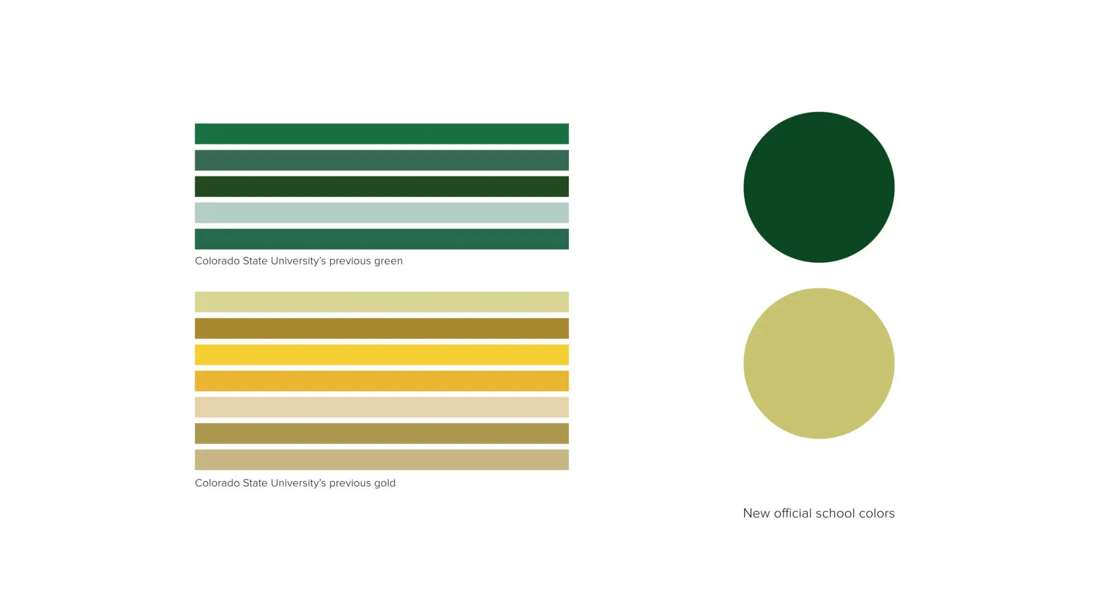
The previous set of CSU brand guidelines included multiple iterations of the school colors based on the media format or production method. This approach often confused users and led to incorrect color choices on different applications. We simplified each brand color to one that displayed well regardless of medium. Many universities in Colorado use gold as one of their primary school colors. We identified a new CSU gold after an extensive audit that identified a distinctive new hue.
Giving the new wordmark a sporting chance
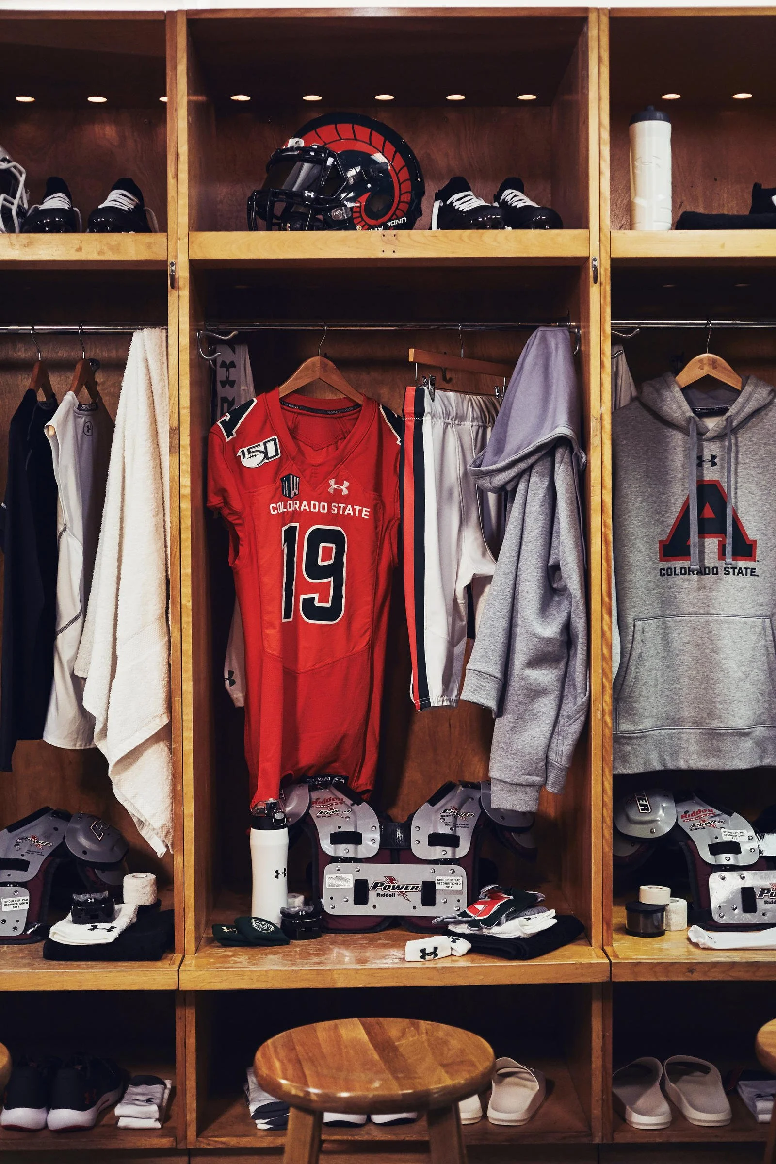
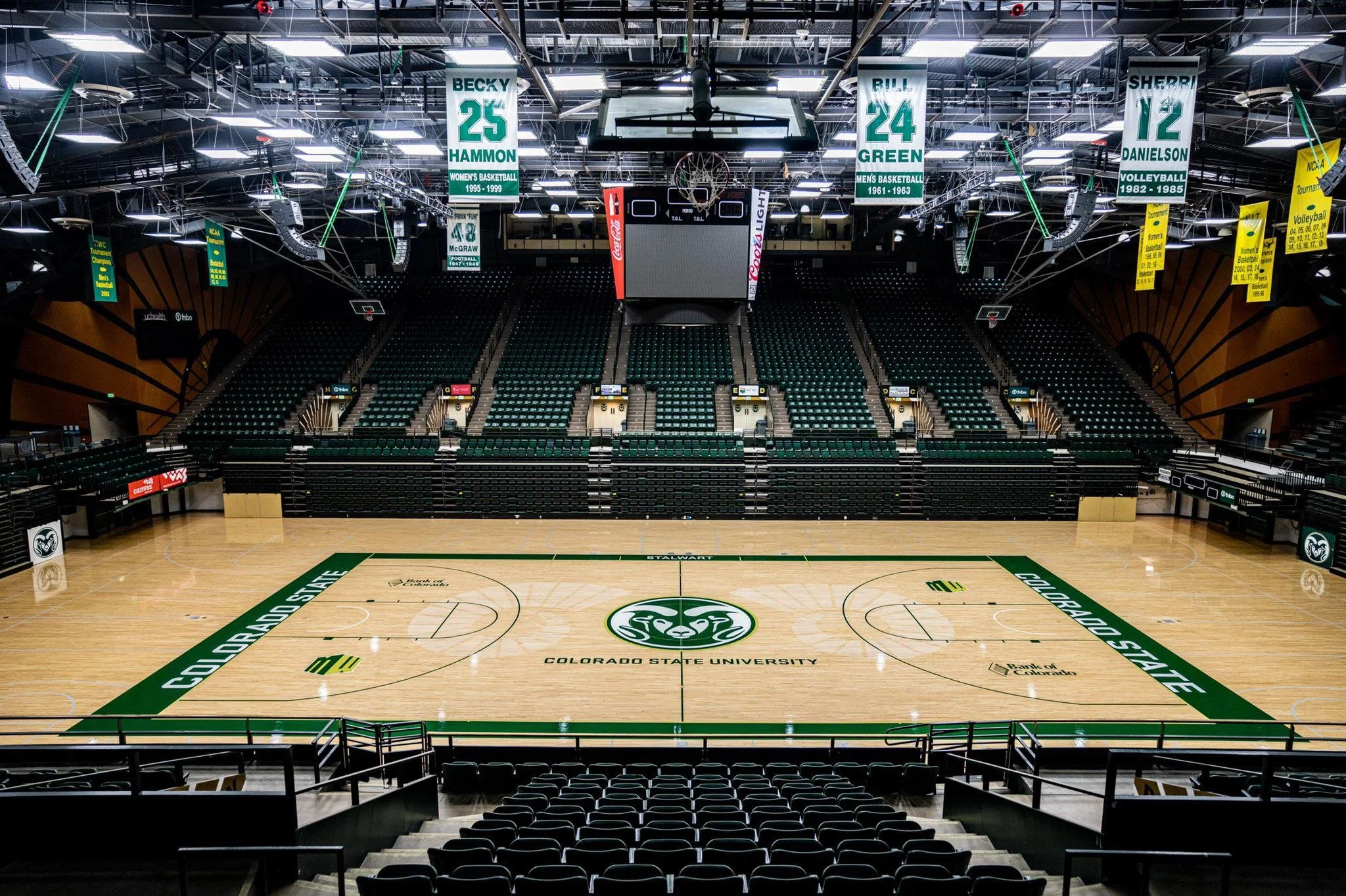
We worked with our partners in athletics marketing to roll out the new mark before bringing it to the academic side of the house, knowing that most university communities are more accepting of new identity work when introduced within the context of athletics. The new wordmark made its debut on uniforms across our programs, making its way to our new on-campus stadium, the hardwood of Moby Arena, and merchandisers’ shelves.
Photo Credit: Under Armour
Photo Credit: Under Armour
Photo Credit: Under Armour
Photo Credit: CSU Athletics
Photo Credit: CSU Athletics
Photo Credit: CSU Athletics
Photo Credit: CSU Athletics
Photo Credit: CSU Athletics
CSU’s scattered approach to branding was transformed into a coherent and consistent system easily recognizable across every touchpoint.
Before
Before


